Who?
Made with FITCH Digital London, including Alex Anpilogov (Creative Technologist), Graham Sykes (2D Director)
What?
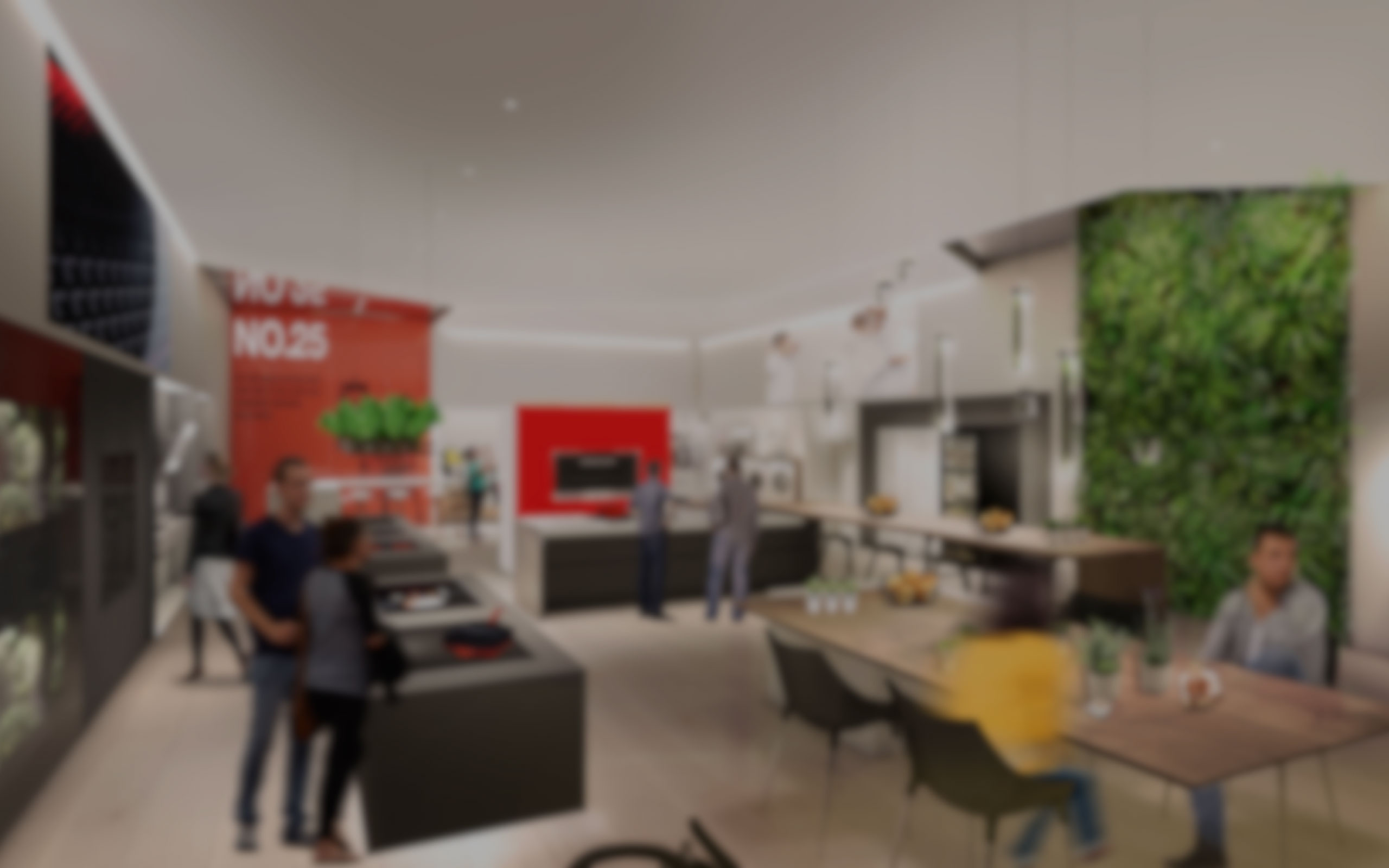
FITCH designed the new Miele Experience store, a forward thinking retail endeavour. Live cooking experiences, alongside rich interactive digital touchpoints, offers consumers a unique sensorial journey, allowing ‘first-hand’ exploration into the true benefits of the Miele product range. On this project, I was in charge of designing the experience of the digital touchpoints.
When?
September 2016 - February 2017
First store launched in August 2018
How?
UX design / Content Strategy / Storyboards / Trello / Google Spreadsheet
CONTEXT
The concept has been developed by the 3D team. As the digital team was not involved from the beginning, we had to take on the technical aspect of the digital touchpoints they came with. In total, I had to develop 6 of them.
- M-Touch Display
- Digital Oven Wall
- Digital Hob Display
- Consumables Wall
- Washing Machine
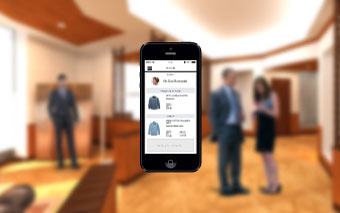
- Welcome App


I was in charge of doing the wireframes for those touchpoints, which included in my process content strategy and storytelling.We were working closely with a third party to build our digital concepts and integrate them in the physical store. In consequence, we had to take into account the ergonomic of the screen and the content on the final product.
THE PROCESS
Each touchpoint had its own range of products so different features and stories to tell. I show in the next section the process for the Digital Hob Display that cover most of the different work I had to do for all the different touchpoints.
Brief
Show the hobs features and product catalog
The physical aspect of that touchpoint on the 3D concept was a screen embedded in a table, similar size as the hobs that would allow customer to know more about the benefits of Miele's product and to see the range of products they offer.


Initial 3D concept of the Digital Hob Display
After a first analysis of Miele’s hobs products, I drafted different sitemaps with interaction principles based on basic user journeys. It had to show the two categories of hobs (electric and induction) and the different features. My main idea was to have an easy structure from exploring the benefits of the category and then see the range of products.
I made a quick prototype on Proto.io to show the basic interactions and principles of the touchpoint. The feedback from the client was that they wanted to put forward the induction hobs features. I came up with a final customer journey and a related sitemap to then create the wireframes.
Once signed off, I went into the details of each features and each characteristics of the different hobs to develop furthers the wireframes into actual content.
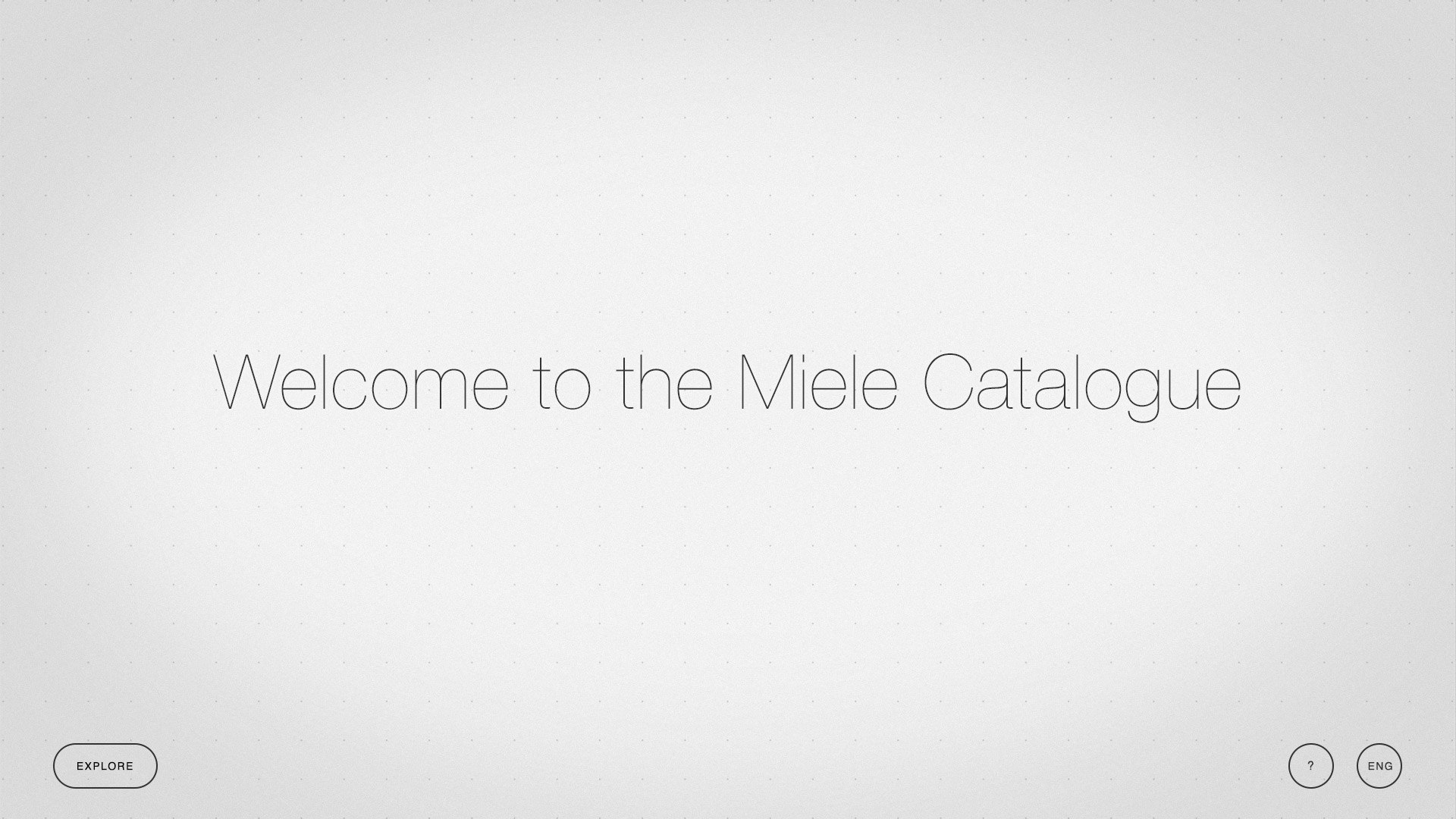
Catalogue
To have a clear process, we built a spreadsheet that gathered all those information for each touchpoint. Based on the sizes of the different hobs, we could come up to the third party company with suggestions of screen size we needed to embed in the physical store. I also listed everything the customer might want to know about the products and made a content document.


Spreadsheet listing all products to be displayed on the touchpoint and their features
I developed further the proto.io prototype and handed it over to the UI designers as they were working in parallel on the UI and animation for the features.
Features
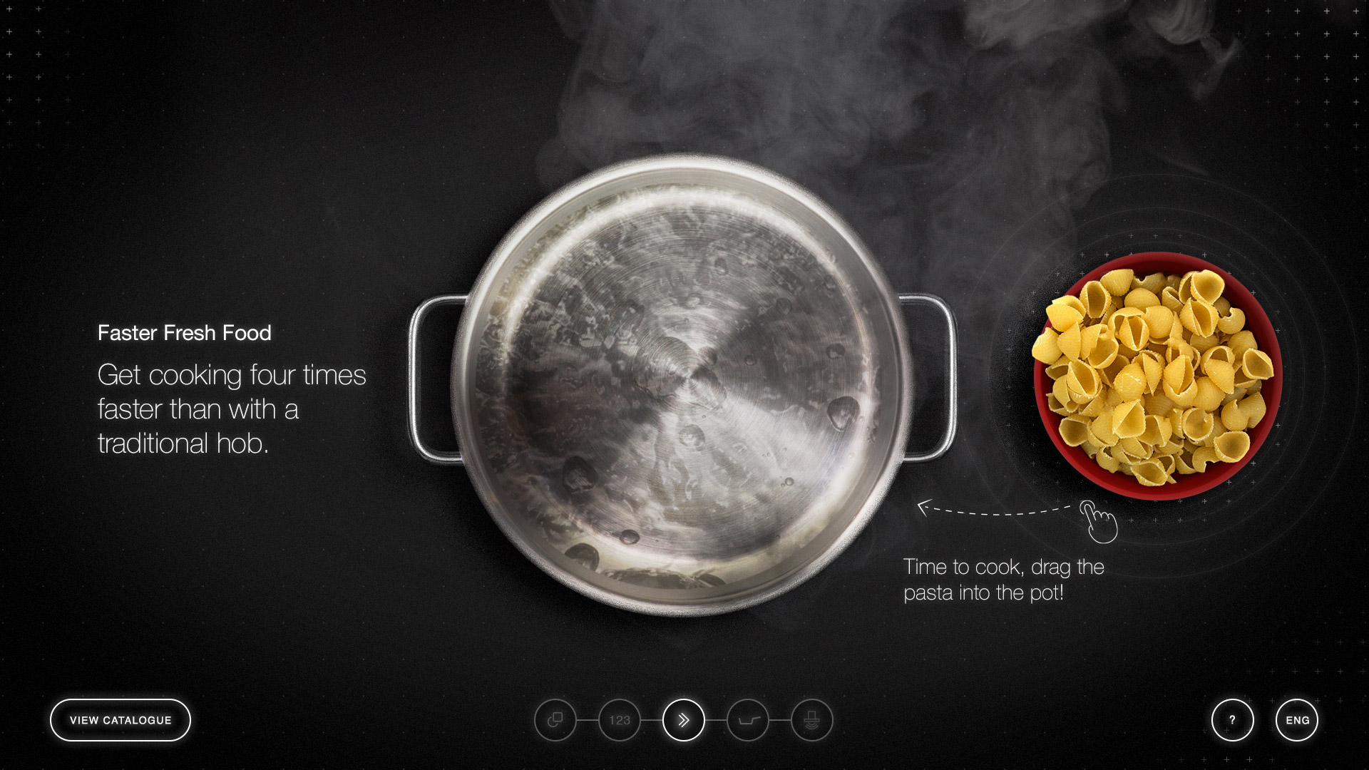
To showcase the benefits of Miele’s induction hob, we had to show how special were the different features in an interactive and engaging way.
By reading the features, I imagined a basic story of a user who would use an induction hob to cook a meal. I started to draft a storyboard, with a basic principle of interaction: the user would have to do one specific action at each step, presenting each feature.
Alexey (Senior Creative technologist) and Graham (2D director) approved my storyboard and went further by developing it into UI and animations, in parallel of the UI for the catalog.
Built touchpoints
All the touchpoints were built by the third party company in a demo lab at Miele’s office, and connected to Google analytics to run tests before building the final experience stores.
RESULTS
Miele Yorkdale Store has launched in august 2018 in Toronto.
You can see it in action on this interview by Breakfast Television Toronto.
