Who?
Made with FITCH Digital London, including Alex Anpilogov (Digital Director), Lucas Pion (UX Designer)
What?
Macerich, an owner of multiple shopping malls in US, asked FITCH to build a service for digital brands to launch and run physical stores quickly and easily. We delivered this complete service called BrandBox, working on both physical and digital aspects: modular physical boxes that brands can customise following a step by step process on a web platform. I was in charge of the UX for the whole digital platform and the marketing website.
When?
September 2017- November 2018
How?
Service design / UX design and space design methodology / day-to-day client meeting / daily stand-up / Jira / Axure / Airtable
CONTEXT
The client’s brief was short :
We want digital brands to open physical stores in 4 weeks.
Behind this short brief, a complex process had to be understood to then be simplified. Two different projects were to be thought and done: the service (including physical, digital and human services) and the marketing website to lead interested digital brands to sign up to the service.
3 main scopes of work were divided in 3 teams, in different locations:
- Brand design at FITCH New York
- Space design at FITCH Columbus
- Service design and Digital design at FITCH London
My main focus was on the service and digital side, but still thinking in an overall business strategy.
THE BRANDBOX SERVICE
Before working on any of the 3 main scopes of work, many interviews and meetings were run to understand the complexity of opening a store:
- To find what were the fear of digital brands to open physical stores,
- To know what are digital brands needs
- To get an actual step by step process from the idea of opening a store to the moment the store opens
- To define all the stakeholders involved in this process
Key results of interviews were:
- A really long process (12 to 18 months average)
- Too many stakeholders involved at different timings of the process
- A non-linear and non-clear process that confuse digital brands, they don’t know where to start
- A lack of analytics in physical store
From brainstorming to wireframes, we drafted an ideal digital service that could help brands opening their store.


Initial BrandBox service stakeholder map to define relations between all users involved in the store opening process


Initial BrandBox service blueprint presenting all the steps of the store opening process
I came up with initial wireframes of an ideal platform, presenting a set of digital tools, that defined the vision of the service. This first draft has been reviewed by the client to then expand in detail all the steps.
After meetings with all teams and client, the team came up with a detailed serviced design blueprint, including actions, tools and stakeholders on a step by step process.
The defined service includes 3 main components that work together:
- A digital platform to make a clear step by step process for brands to open their store
- A retail curator, a dedicated person who accompany the brand on all the steps
- A physical shell, modular enough to quickly customise it according to the brand
With Alex and the product owner on client’s side, we defined the first features and tools of the MVP for the digital platform that I had to create. The difficulty was to have a unique web platform for the different stakeholders: digital brands users, BrandBox users, 3rd party users involved at specific steps of the process. The way we solved this problem is simply by giving access to different set of tools depending on the user, BrandBox users being the main users having access to all the tools.


MVP features listed on an Airtable spreadsheet, classified by user, tool and development phase


Defined step by step journey. Blue steps are the one that are 'digitalised' and can be made on the platform.
I drafted the structure of the platform with its sitemap for the different users, and designed the pages based on the defined MVP requirements to get a unique platform with different access to the different tools, depending on the user.
I built an interactive prototype on Axure in collaboration with Lucas (UX design). On a day to day basis meeting with the client, I presented the UX and improved the platform based on new requirements.


The UI has been done by our digital team in London, following the UX and based on the branding defined by the 2D team at FITCH New York. The development has been done by another company in the US.
Here are some of the tools:
- Store Setup: This tool shows a step by step process as a to do list / task list to give digital brand a clear pathway and help users know what they have to do next.
- Users: For BrandBox users mostly, assign new users to brands and stores. For brands users, it is more a tool to see all the stakeholders involved in the process and reach them quickly.
- Services integration: To get the most of physical and digital, brands can assign digital services for their physical store to get consistency with their existing e-com strategy.
- Analytics: Once the digital services are integrated and the store launched, brands can track their store on the analytics page.


UX and UI of the Analytics page
Other tools include Design Themes to help brand designing their store, Marketplace to call for a 3rd party at specific step, Site Selection to know where to launch their store based on Macerich demographic data.
The physical part of the project was led by FITCH Colombus.
MARKETING WEBSITE
Two main things were to consider: how to talk about the BrandBox service to be clear enough and get brands interested, how to get brands to sign up for the service.
As a new service that simplify a complex process, BrandBox had to explain on the marketing website how complex is the process of opening a store and how it can help brands to do it so. For digital brands skeptical of physical retail, we had also to explain why it is important to think of the physical channel for the business. This education had also to be led with articles. BrandBox had to be the reference for physical retail.
From user flows to a defined sitemap, I created wireframes with initial copy content, in accordance with the evolution of the BrandBox service we were developing in parallel.
Main pages developed were :
- How it works: to explain clearly how BrandBox helps brands all along the whole process, step by step.
- Why go physical: a main page to explain how physical retail is a must for an online brand and why BrandBox needs to exist.
- Retail Academy (Blog) : the idea being a set of articles, courses, podcasts, videos and interviews to talk about the experience of opening and running a physical store.
- Locations page : With Macerich having a pilot location and opening up new locations in the future, we had to think about how to bring those destinations to life, and how to get brands on board.
- Sign Up: the page on which brands will give some details about their business and apply for opening a store with BrandBox.
RESULTS


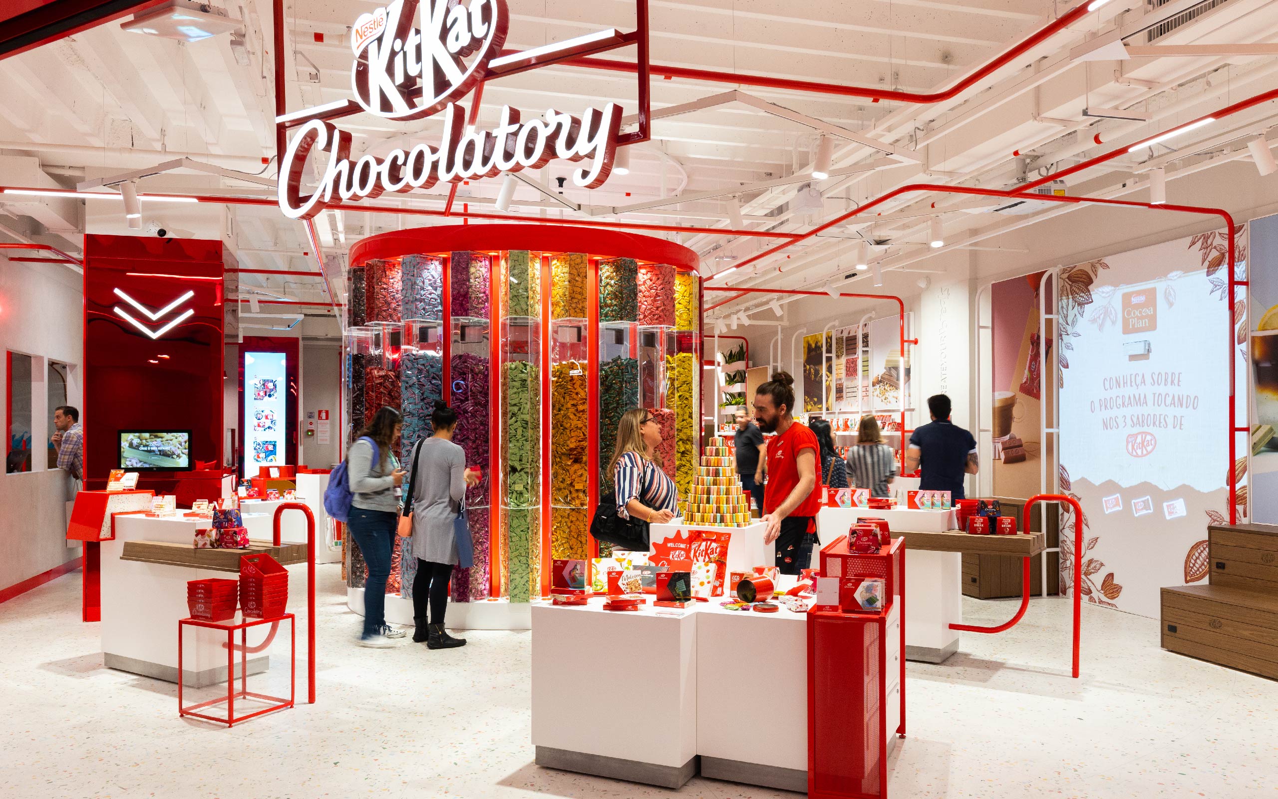
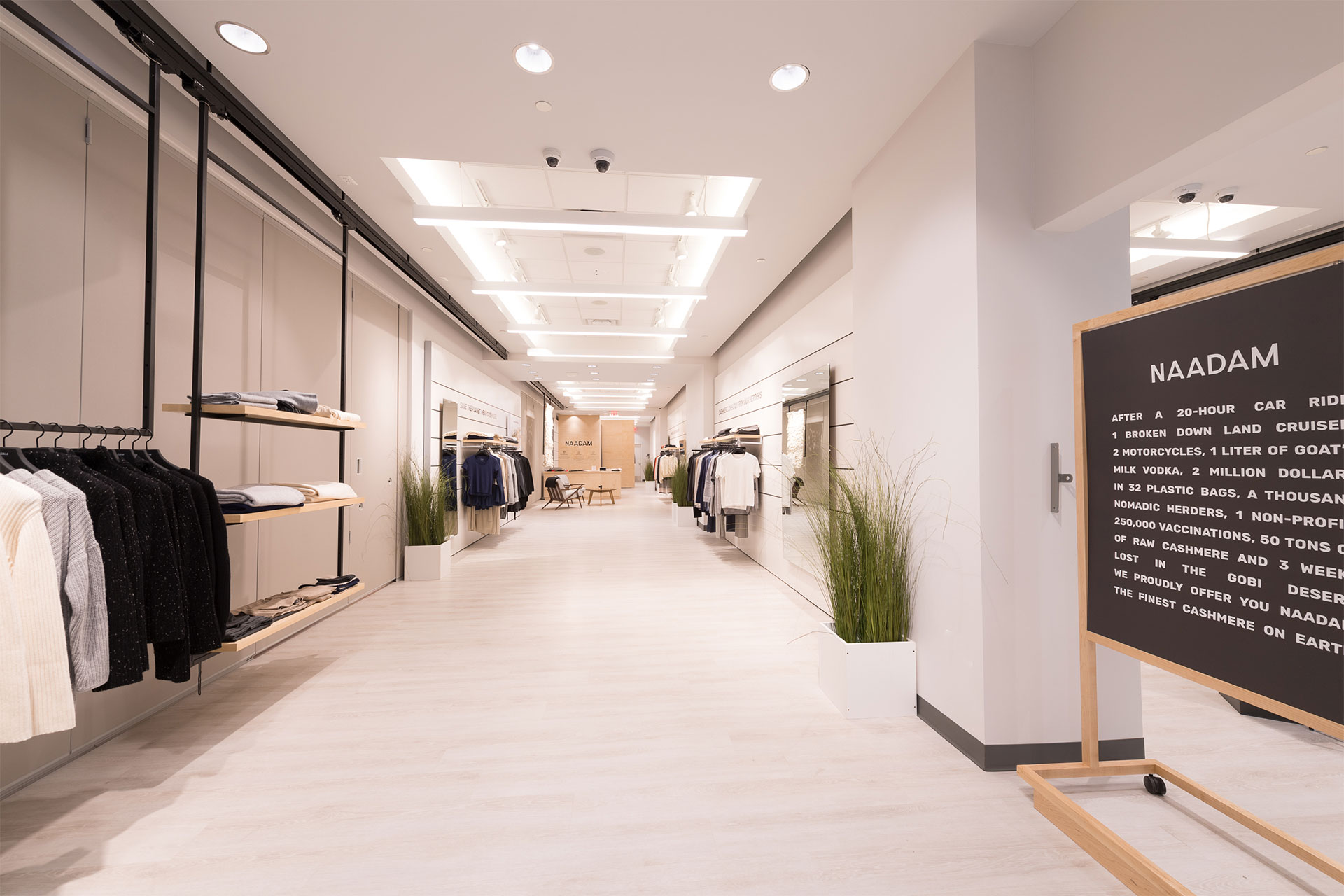
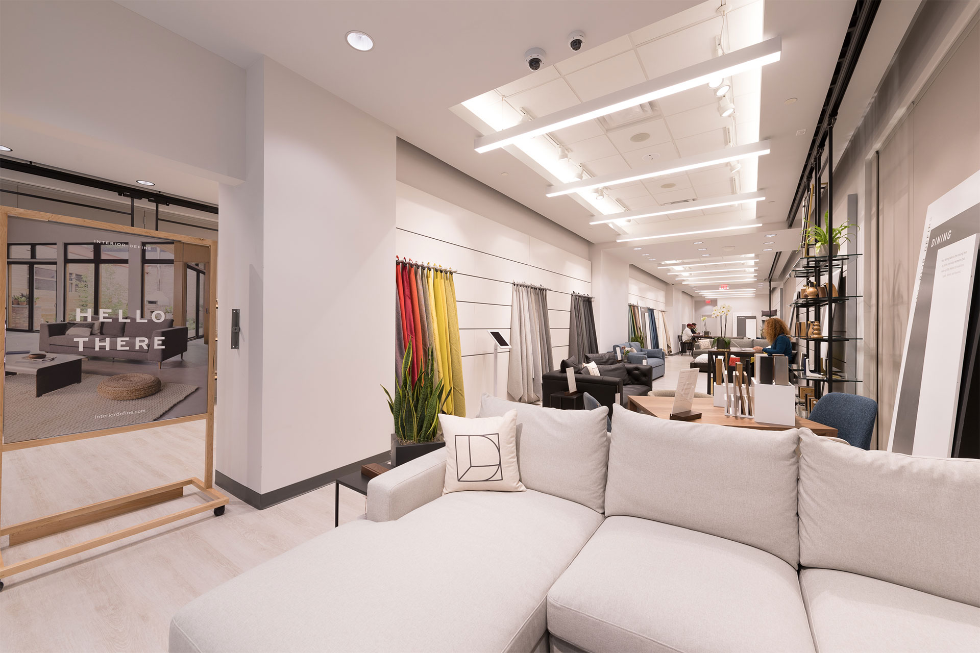
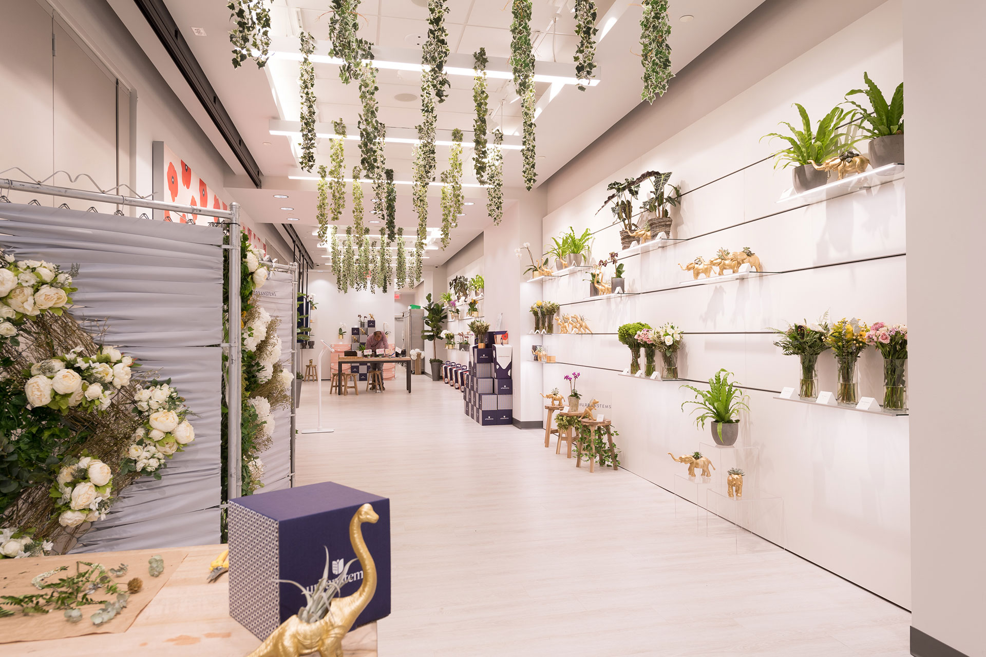
Six digital brands (Naadam, Nectar, Winky Lux, Interior Define, UrbanStems and DKNY) have opened and launched their store in the pilot location of the project, Tyson’s Square, in about 4 to 8 weeks. More locations are coming soon.
According to Macerich, the full process from “I want a store” to “My store is operational” is now targeted to be 3 weeks – an average of 20x faster than the original timeline.
BrandBox has been featured in Forbes, Glossy, Little Black Book, PSFK.
