What?
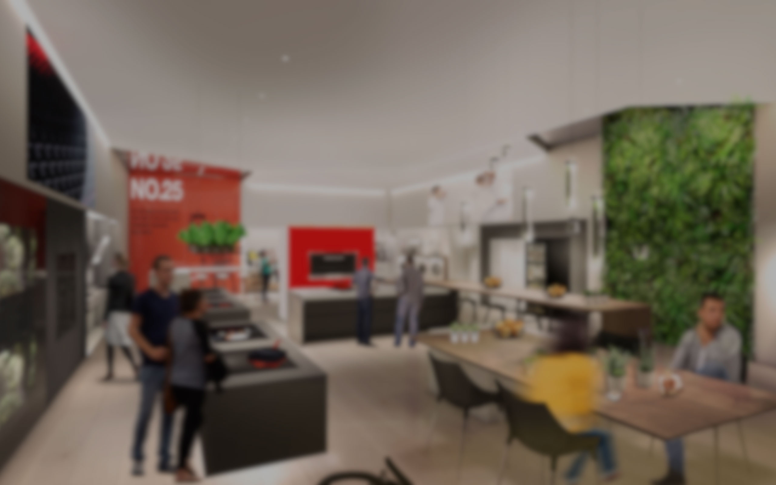
Nestle asked FITCH to make the Chocolatory store concept for the Brazil region, in São Paolo, with the aim to extend this concept to other cities around brazil. Within an omnichannel strategy vision, this store had to mainly attract the GenZ, making this store a digital-first experience.
When?
December 2018 -
October 2019
How?
CX / Service design / UX / Management / Space design / User testing / Prototyping / Axure
CHALLENGES
As a UX lead on this project, I had several challenges to cover:
Management challenges
- Teach new UX members FITCH methodologies
- Know more about them to dedicate the appropriate tasks for them
- Leverage their skills and potential for the project
Project challenges
- Project that covers 8 different touchpoints linked together through a common overall UX, but that would have unique purposes and ways to interact with.
- A truly digital-first retail store project, needing a comprehensive space layout that fully integrates digital services and experiences.
THE PROCESS
I was involved in all phases of this project, from definition to delivery. The way we worked on this project went from defining the overall customer experience, down to defining the way the different digital services would work, to get then in the details of the interfaces in order to bring the vision to life.
CX design - End to end experience
During the pitch phase, the strategy team came up with branding principles that would be the base of the experience we would design. The experience had to be:
FUN - PLAYFUL - ENCOURAGING - INSPIRING
I worked closely with the strategy and 3D team to come up with a set of digital touchpoints that would leverage the defined experience principles in-store, while thinking in the omnichannel vision. To do so, we made a spreadsheet using a framework of mine, making sure that we would cover the end-to-end experience from Awareness to Loyalty, while responding to the customer needs and bringing brand benefits.
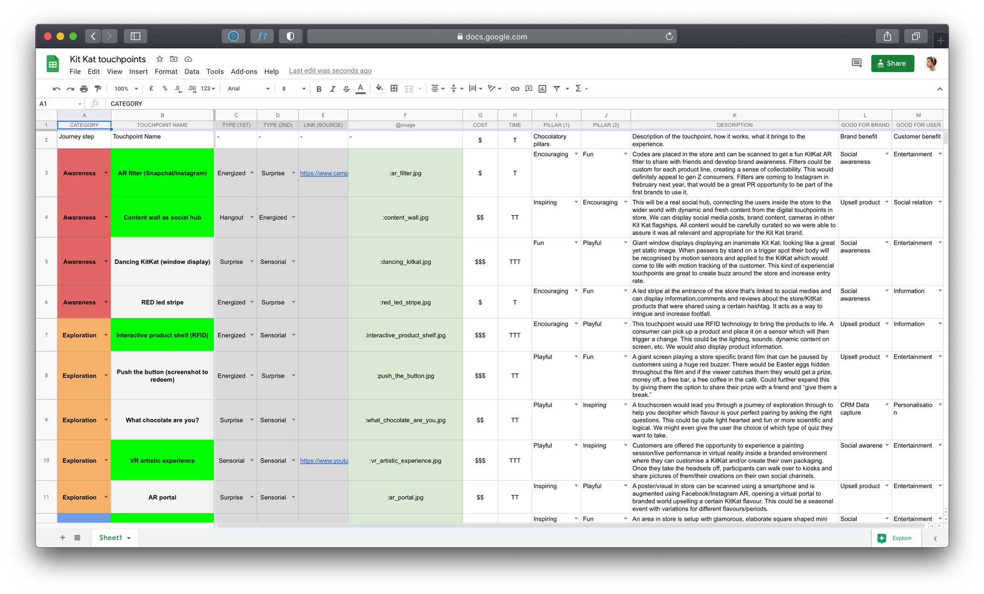
Initial touchpoints list ideated with the 3D and strategy team
The clients selected 6 main touchpoints from the list to develop during the design phase, along with the KitKat Chocolate printing, which they were developping in house, and the Order Management System that allows to deliver a seamless service between staff, operations, and customers.
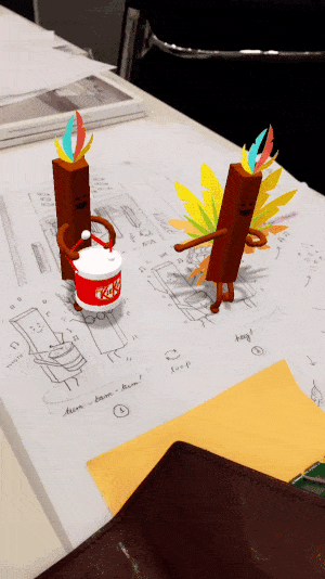
AR Filters
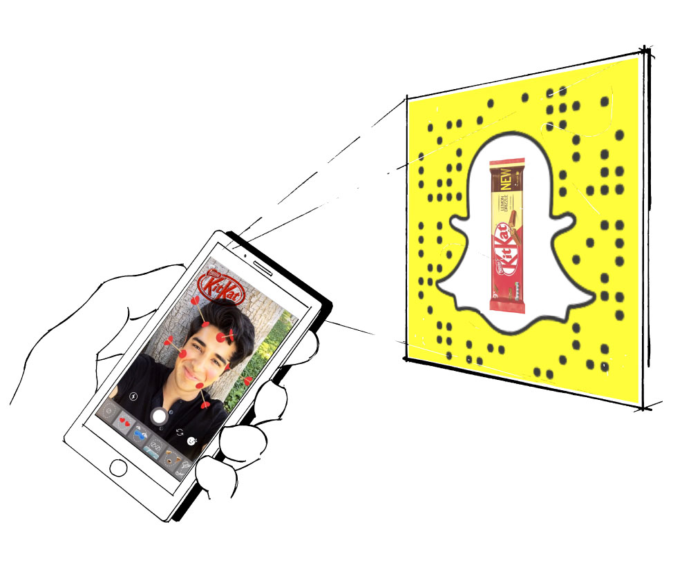
QR codes / Snapchat Code are placed at each specific zone of the store, telling different stories through AR filters that consumers can play with.
VR Experience
Customers can discover how KitKats are made in a branded VR world, with a storytelling around the brazilian KitKat factory.
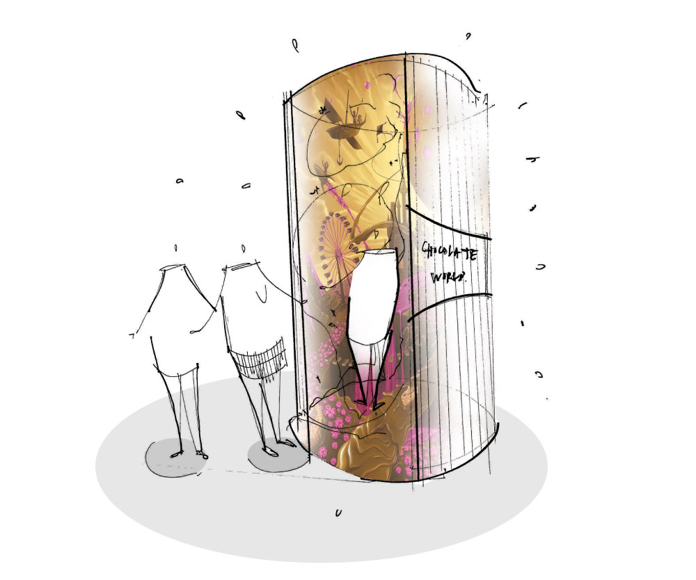
Vending machine
Customers could buy the best selling KitKats outside the store (even when closed) and participate to a game with products to win, giving them a reason to return.
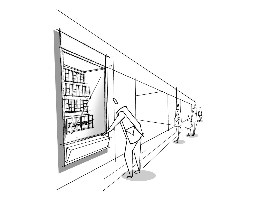
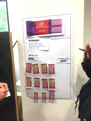
Pick & Mix Deep dive
A zone with tablets would give users the ability to learn more about the products of the Pick-n-Mix range.
Pick & Mix personalisation
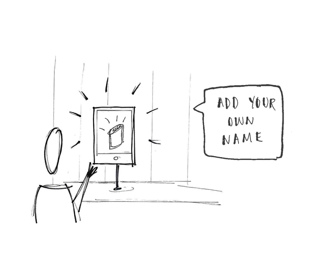
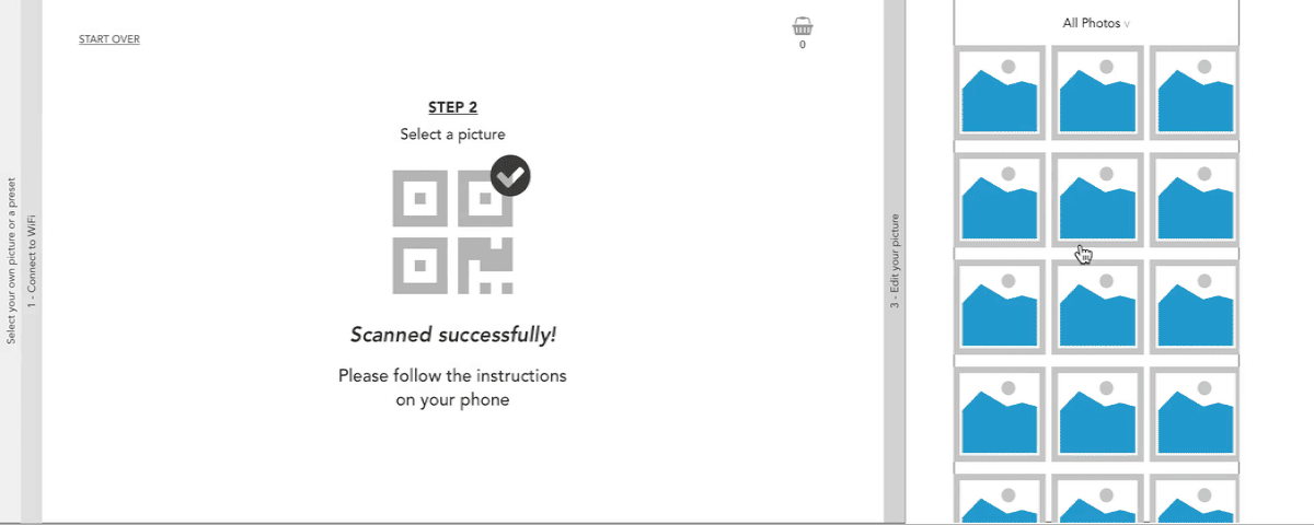
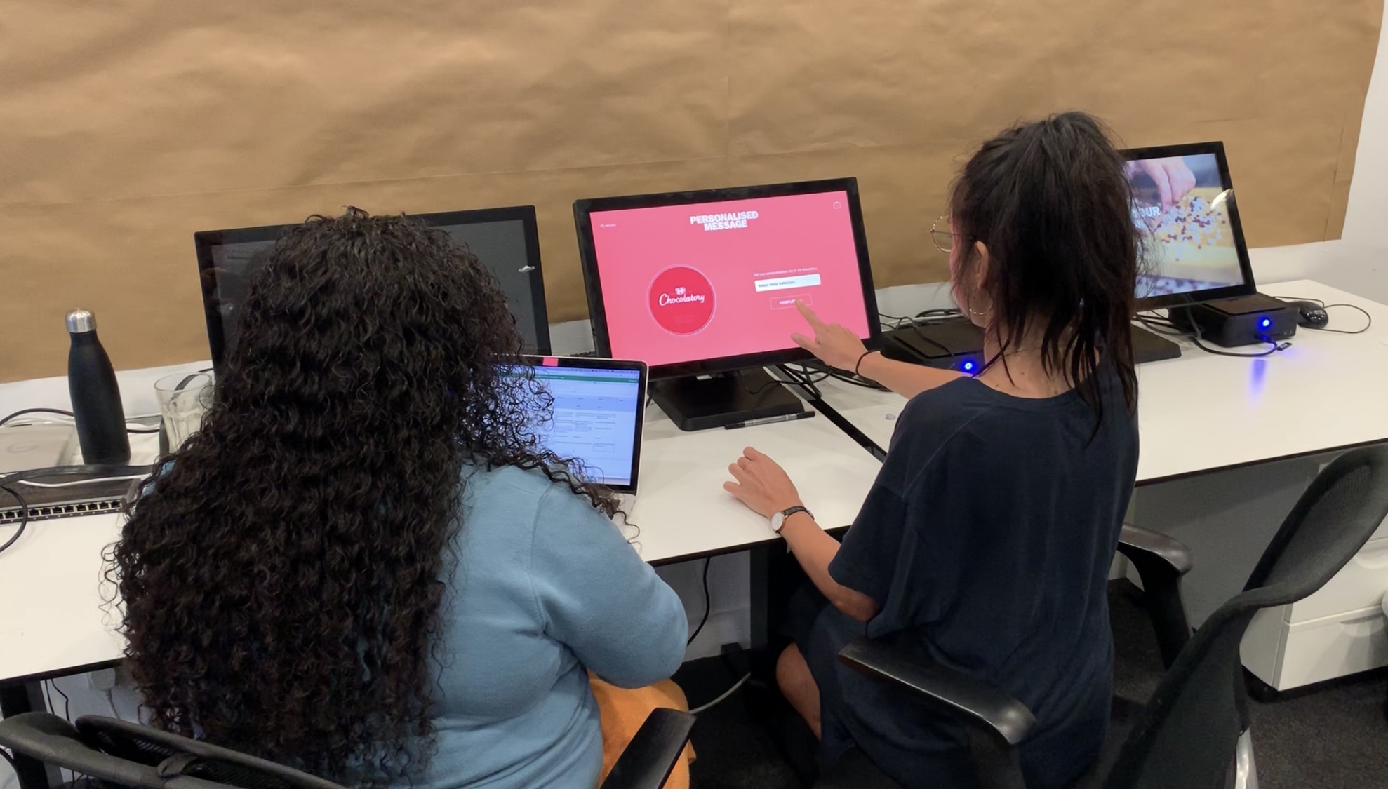
A personalisation area where customers will be able to customize their Pick & Mix packaging with a message or a design.
Vessel personalisation
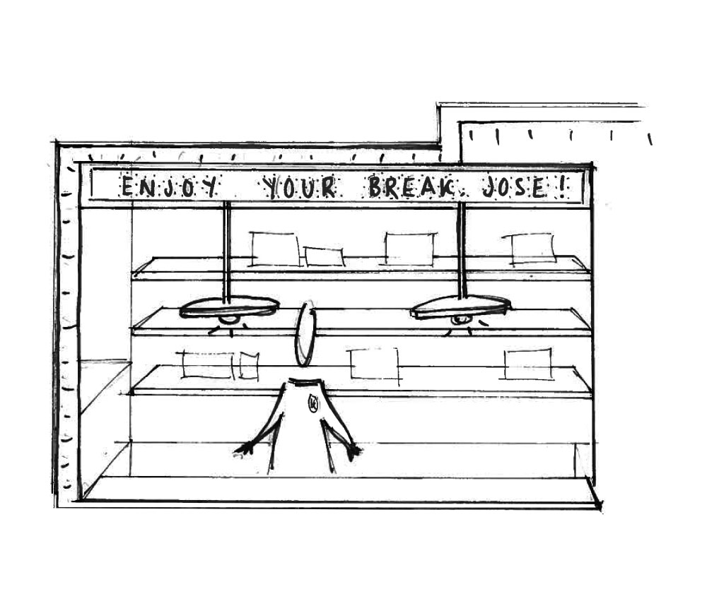
This service allows consumers to create a custom chocolate vessel from a dedicated tablet. It would then be made by a staff member and collected by the customer when done.
Service design - Physical, Human, Digital
At this time of the project, 2 junior UX designers joined the team: Ice and Marianne. I therefore took a step back on my usual work of UX designer to become a manager, being more of a central point between the UX team and the wider team (3D team, Tech team, Strategy team).
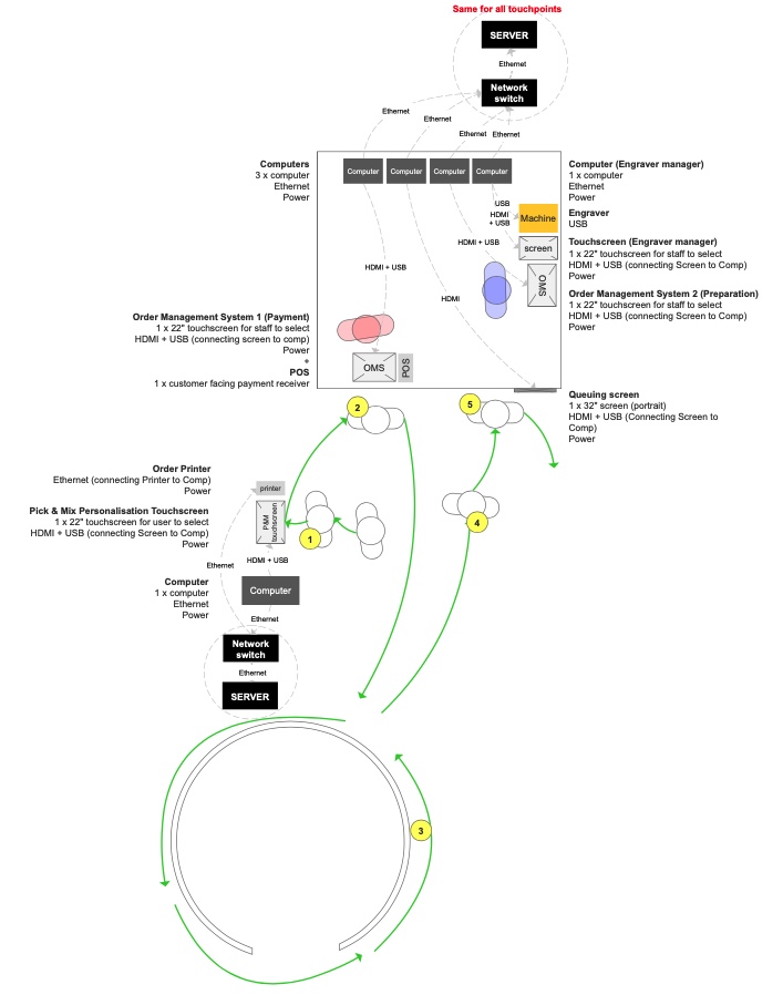
To do so, I drafted the detailed service design blueprints of each selected experience defined with the strategy team, while making sure I aligned with the 3D layout of the store and the hardware requirements. Those flows cover the interfaces used both by the customer and the staff to run a smooth and seamless experience as possible. As the store layout was changing quite often, the challenge was to keep consistent flows by educating the 3D team on the impact their store layout can have on those flows, the services and therefore the experience.
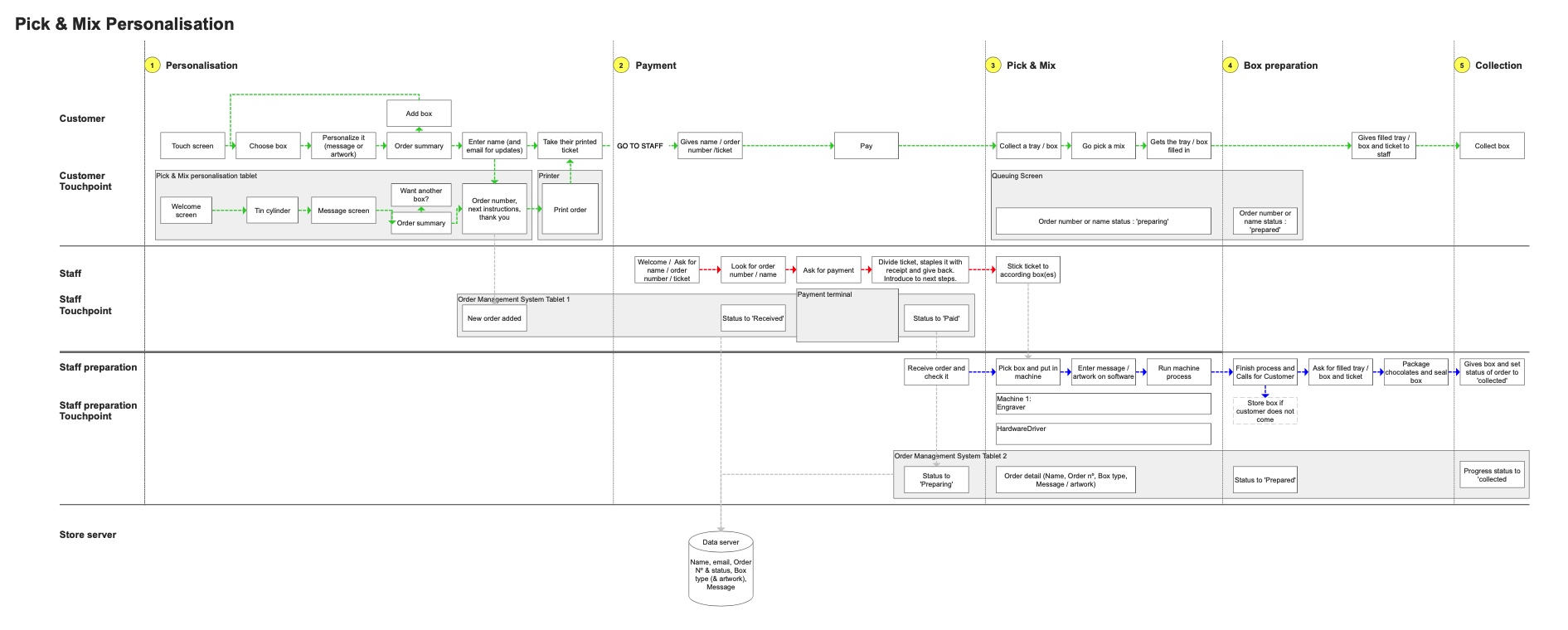
Service design blueprint exemple: Pick & Mix Personalisation
Floorplan design flow example: Pick & Mix Personalisation
Once the flows defined for each touchpoint, I gave the task to Ice and Marianne to work on the corresponding interfaces, while making sure they respected the flows agreed with the wider team.
UX design - Team and project management
Interface Consistency
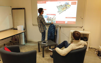
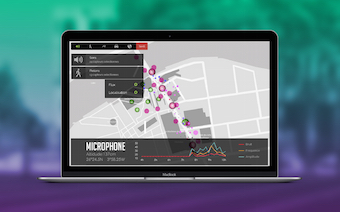
When designing for different touchpoints being part of a unique overall experience, we had to make sure that the interactions and screens would align. Some touchpoints were similar in their flows, so anyone interacting with a touchpoint would know how to interact with another one. To help on this process, we've made interactive prototypes out of those wireframes. Weekly, we would present our work to the client to get their feedbacks for each touchpoint, to make sure they align with their internal strategy and vision.
Chocolate printing prototype example
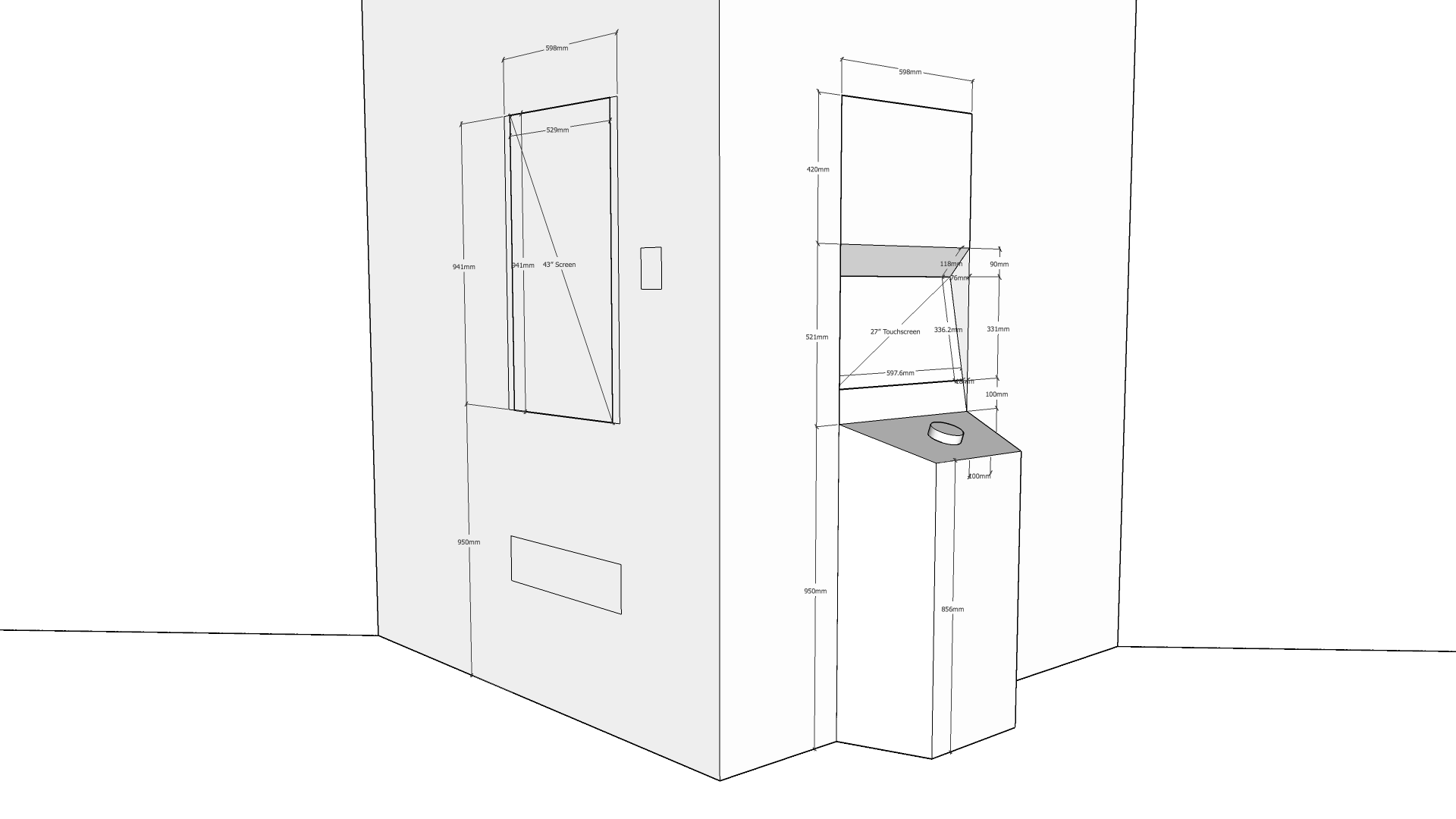
Ergonomy
Another challenge on this kind of digital store project is that we have to think a lot on the ergonomy of our touchpoints from a human body perspective. Our touchpoints had different screen sizes and orientation, placed at different heights, sometimes with physical triggers, and need to be integrated in the physical design. Throughout the design phase, we would then create low-fi prototypes on paper or quick physical setups to make sure our interfaces respect the body expression and a clear visual navigation.
Paper prototype for ergonomy exploration
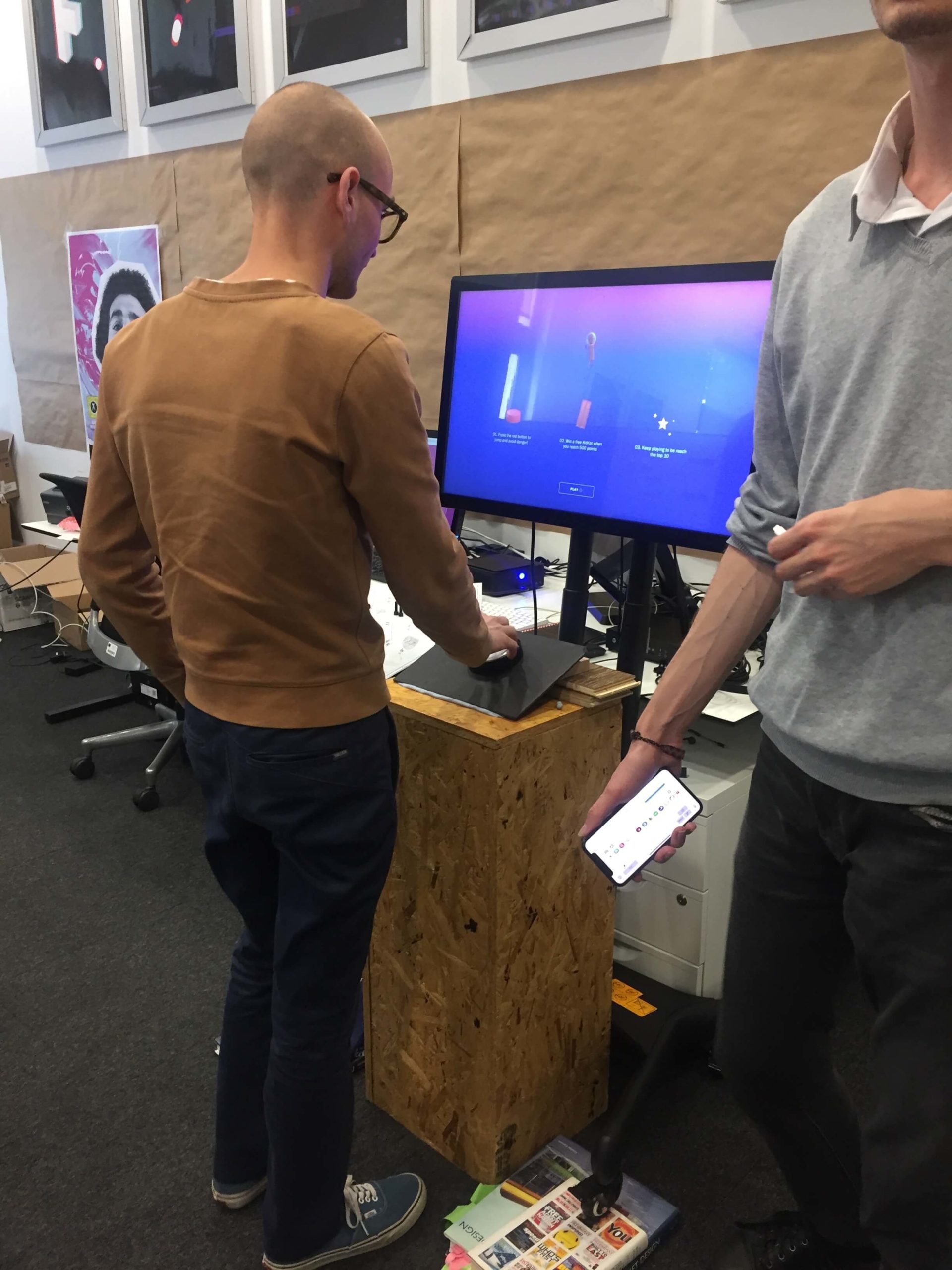
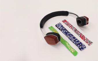
Physical set up prototype for Vending game
Once the flows, screens and interactions were well defined, we did the handover to the UI team who took care of creating the brand UI guidelines. We worked collaboratively with them and the wider team to tighten the interfaces.
Leveraging skills
With a UX team of 3 people and a large range of skillset, I took the advantage of this project to use and leverage our different skills on the different streams of work.
Illustration
Marianne who has UI and illustration skills participated to creative tasks for the VR and AR touchpoints, providing initial creative ideas through sketches.
User testing
Ice who had experience in user testing ran the internal tests at different stages, from the wireframing phase to the development phase, ensuring the interfaces were all easy to understand while providing the relevant information.
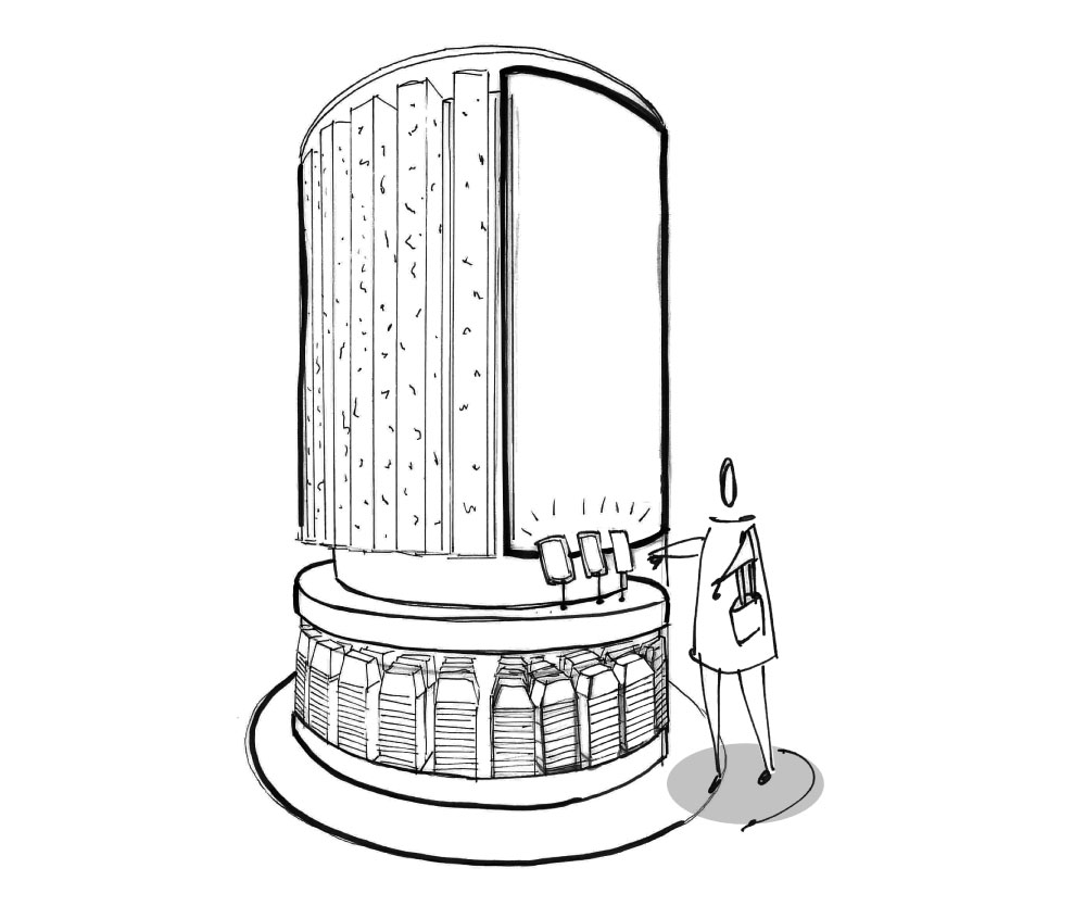
3D design
With my background in 3d design, I could create the physical design of the vending game based on the tested physical setup and in accordance with the 3D team, to respect both the digital interaction and the ergonomy needed for this touchpoint.
Working closely as a team allowed us all to exchange our knowledge and skills.
RESULTS
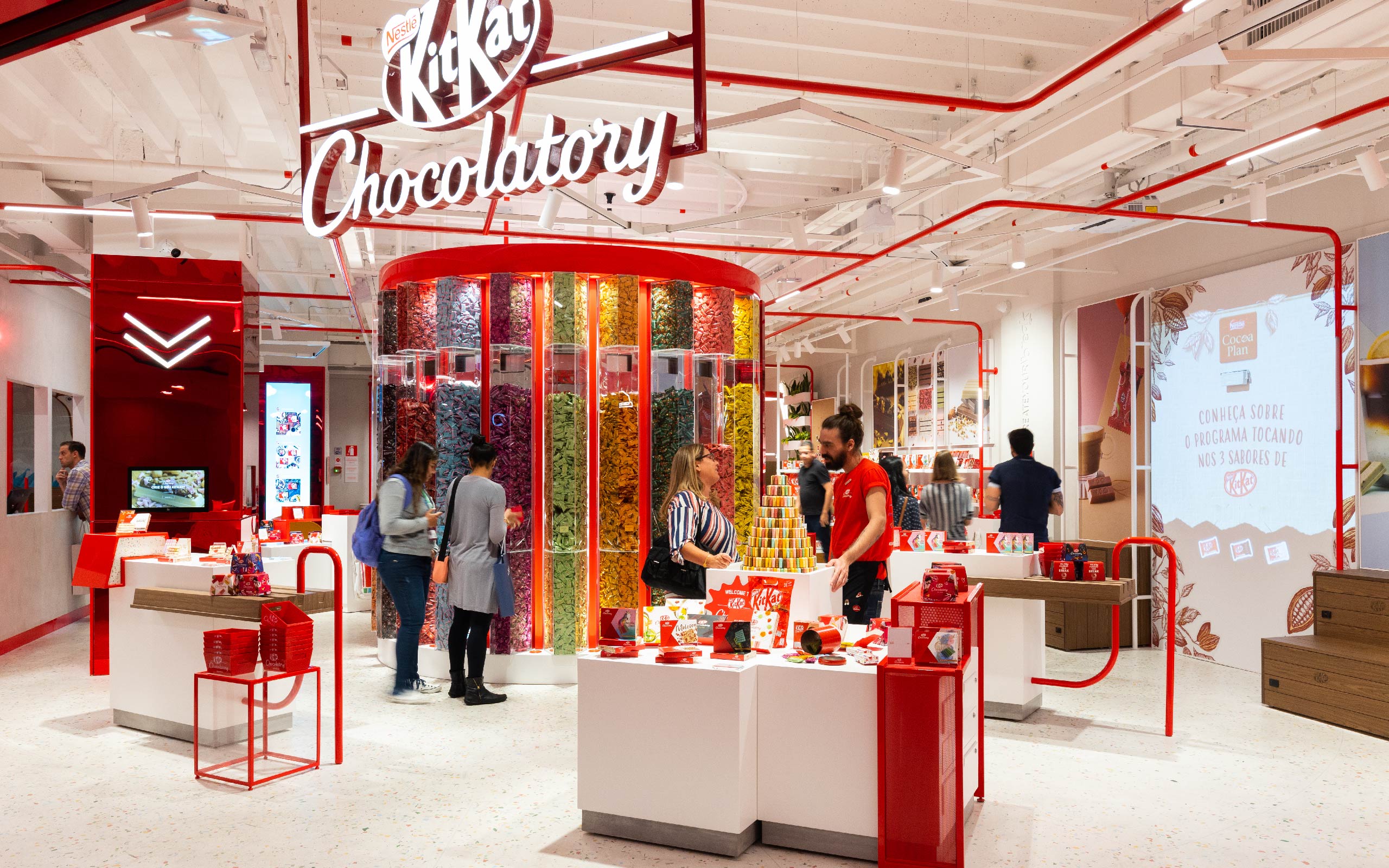
After some trips to brazil for the FITCH team to deliver the work and supervise the development of the store, the first brazilian KitKat Chocolatory flagship opened in October 2019.
The KitKat Chocolatory São Paulo got a huge success and saw their forecast sales for the month sold in a week at the opening. It also won the Innovation Award for Digital integration by the Retail Design Institute's, class of 2019.
After this first big step in the brazilian market and to get towards an omnichannel strategy, we pursued our collaboration with the KitKat Brasil team by designing the KitKat Chocolatory e-commerce website.
Managing a UX team for such a project was a totally new exercise for me, which made me see growing as much as my team members were growing. KitKat was the perfect project to teach the juniors what I've learnt so far at FITCH, while making sure they would have as much fun and freedom to create an outstanding store experience.